Thomas Trimingham
Put Yourself in Position to Handle the New Demands on Your Art Department
When customer demands collide with your production team’s needs, things can get stressful. Here’s how to cope.
YOU’VE SEEN IT in your shop: Run sizes are falling and orders are becoming more complex. This dramatically changes the nature and volume of the artwork your creative team must produce. What changes do you need to make in your art department to adjust to the rise in lower-volume work?
For many print shops today, the new reality of customers demanding intricate designs and faster turn times – with lower quantities – has already become a daily struggle. [Editor’s note: Some shops add direct-to-garment machines to potentially address some of the challenges of small, yet complex orders, but the focus of this article is on traditional screen printing. For more on implementing DTG, check out articles in Screen Printing’s April/May and June/July 2017 issues.]
Your art department staff can feel overwhelmed by having to satisfy competing demands from the customer and the production department. Often a client will want more colors at a lower cost in a small order, while the printing department will ask for lower screen counts, faster setups, and fewer on-press revisions. These seemingly disparate demands can slowly build up and cause increased job stress, lower morale, and eventually higher turnover in your art department if steps are not taken to address these changes.
Deal With the Problem Early
Before you address the art department challenges directly, it’s important to consider how the problems start at the quoting and sales stages of your process. Just because the pain isn’t felt until an order hits the art and production departments doesn’t mean that the issues couldn’t be dealt with sooner. If your art department is showing signs of strain from increased order complexity and smaller quantities, take a careful look at sales processes first.
- Check to make sure you have clear policy guidelines for sales related to number of colors, art complexity, and recommended order quantities for each variable.
- Have a solid “no” level so everyone is aware when to turn away an order that just doesn’t make sense – and stick to it. (Does the art need major changes? Is it massively complex? Is the order quantity super low? Sometimes there isn’t enough money in such jobs to justify even quoting it or talking with the art department about it.)
- Identify which types of clients are causing the majority of your complexity issues. Are there ways to adjust your current policies to incentivize changes for these clients (discounts, free delivery/shipping, etc., in exchange for either decreasing the complexity of the design or bumping to a larger order total)?
- Plan additional training for your sales staff so they can better guide clients with regard to adjusting artwork to fit order quantities. (Training sales staff on how to reduce art complexity can pay big rewards over time.)
- Make sure every sales process includes a request to the client for a larger quantity. (It’s surprising how often simply asking for this will produce a positive result.)
Once the sales department has been prepped to address the complexity/low quantity issue you can turn your attention to the art department.
Be Smart With Art
When adjusting orders in the art department for lower volumes, it’s critical to keep the customer involved and make sure they are satisfied with all adjustments to artwork.
AdvertisementWhen screen printing artwork becomes an issue regarding order quantity, there’s usually a lot of colors or complexity to the design. It’s important for a screen printer to know their costs and profit margins so when they quote jobs with these challenges, they can avoid boxing themselves into orders
that will have no room for error and very little or no profit.
In addition to the monetary concerns, these situations must be handled delicately to manage both the customer’s needs and art staff’s concerns so everybody is happy with the final result. Although artwork for screen printing is always different from one order to the next, order volume issues will typically fall into four situations:
- A customer requests complex artwork developed for a small quantity order.
- The order hasn’t been placed yet but a customer would like a low quantity and they already have complex artwork.
- A loyal customer that comes back often has re-ordered a job with complex artwork, but at a much smaller quantity than a previous order.
- A customer has placed an order and then decided to reduce the order quantity after the process has already started.
In the first two situations, the client hasn’t completed the ordering procedure, so it’s possible for the sales department to be invited to assist with the art process. The goal is to create some options for the customer that will provide what they want in the artwork, but with a simplified design better suited for printing a small order.
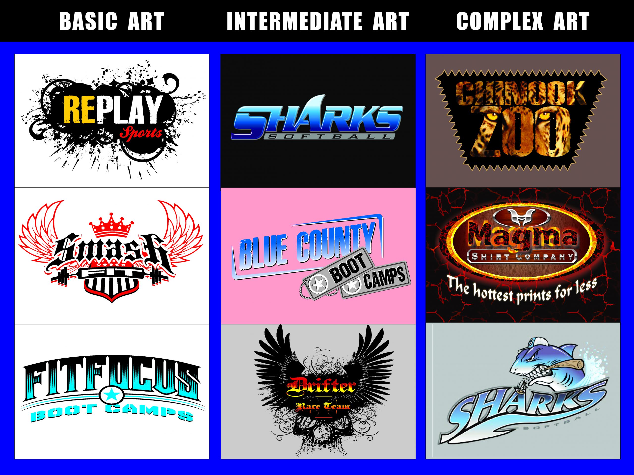
What defines complex artwork vs. artwork that’s simpler to print at a small volume? One way to differentiate between the two is to have a guide that grades art (See Figure 1). This way, when artwork is presented to sales, they can identify if artwork is basic, intermediate, or complex. Basic artwork has type that may include very simple graphics without a lot of pieces and typically only one to three colors. Intermediate artwork has more graphics and integrated typography with multiple pieces, patterns, and possibly some halftones. Complex artwork includes designs that are custom rendered, illustrated, and have many details and colors. Complex designs could also have few colors, but still include a lot of elements and many small pieces and halftones. These can be judgement calls on the part of the sales team, but having several categories and a set method
categorizing artwork can at least give the team a starting point to “red flag” orders that might cause problems at lower quantities.
Tweaking Client Artwork

When it comes to adjusting or changing customers’ artwork, tread carefully. To suggest changes to the artwork, you’ll need some knowledge of the client and how open they are to design modifications. The last thing a printer should do is try to force a client to adjust their artwork so it’s easier on the printer. A better approach is to discuss the options with the client to see if they are open to suggestions; then you can propose several alternatives. In the case of the first two situations mentioned above (the client hasn’t developed the art yet, or they are bringing the design into your shop), a short discussion can illustrate how a different design could be developed that would be less complex, but still meet the customer’s needs. Sometimes this will include lowering the color count by using the shirt color more (if possible), switching colors to hues that can blend and make other shades, or changing graphics to a stock template or premade solution.
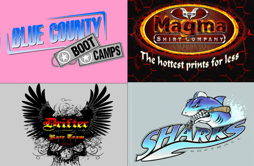
Lowering a design’s color count can be a very effective way to minimize costs. (Unfortunately this won’t work on all designs, or too much work would have to be done to implement it.) To test this process, select a full-color design that would be difficult to reproduce with screen printing (See Figure 2), and convert it to a duotone look with one or two accent colors. This method is simple to do in Photoshop and it can still simulate a complex design well. In some cases, the end result may be stronger than the original full-color version because the process will dramatize elements and make the other parts of the design more subtle.

To create this effect in Photoshop, just make a copy of the original design, then create a duplicate layer inside of the design of the graphic elements. With those layers selected, use the Colorize command inside of the Hue/Saturation dialog box (Click the button on “colorize”). You will see the selected design areas convert to a duotone. Next, slide the Hue slider over until you have a colorized version that is appealing for the graphic. Finalize it by adjusting the Saturation slider to brighten up the accent color in the image. The last step is to select the complimentary color areas and then go through a similar step to create a dramatic design solution that still has a limited color pallet. (See Figure 3.)
Switching hues in a design to ones that can be blended to reproduce additional colors is a possible solution, but it requires an experienced artist to suggest – and execute – this option. Images with colors that can be reproduced using blends of other colors can be difficult to control without a lot of previous testing with inks, halftones, and overlapping images. If a design includes a lot of reds, oranges, and yellows on a black shirt, an experienced separator can sometimes create other colors like brown, maroon, or even green (See Figure 4). The key to editing using this process is to understand what ink colors can be created – and what can’t. Another concern with this type of color reduction is that it will often add complexity and separation time, so this may not achieve the goal of cutting down on production time for a smaller order. For some customers, however, this type of solution can give them more colors, with less cost.

Changing artwork to a stock template or premade solution is one of the best ways to both reduce customer costs and ease printing issues. Having some high-quality graphics available for clients to choose from can save those lower quantity orders and make production much easier. Sometimes it’s simply a matter of having a customer browse through a stock collection so they can pick something out, and other times it’s just a quick graphic that already has simple colors applied. When showing art from a collection, it’s always a good idea to minimize the choices and let them give you a lot of feedback during the process. If you dump hundreds of images and type fonts on a client, they will quickly get overwhelmed. If they aren’t finding something that works right away, it might be helpful to offer to put something together for them and then have them decide at a later time. (Typically there is a small art or pre-order fee for this that can later be applied to the final order.) Doing this can minimize the time spent selecting artwork, show off your team’s customer service efforts for smaller orders, and, ultimately, gain a happy client with an art order approved.
Collaboration Is Key
The last two situations (a client orders a set quantity and then re-orders the same design but at a lower quantity, and a client reduces the order amount at the last minute) are best handled through careful discussions among the sales team, the art department, and the customer. In many cases, if it’s a repeat customer, the shop might opt to print the order and accept the lower quantity while holding the cost the same. In those situations, it’s still a good idea to let the client know they are getting a big discount so they don’t make it a habit or tell others they can do this too. Other times, however, a hard discussion will have to take place about changing the artwork or increasing the price due to the change in quantity. Clients that won’t work within these policies are rarely clients worth keeping.
Low quantity orders with increasingly complex artwork seem to be here to stay for screen printers. Using a combination of sales policies and careful communication between customers and your art department can make navigating small orders easier and more profitable with fewer production challenges.
Let’s Talk About It
Creating a More Diverse and Inclusive Screen Printing Industry
LET’S TALK About It: Part 3 discusses how four screen printers have employed people with disabilities, why you should consider doing the same, the resources that are available, and more. Watch the live webinar, held August 16, moderated by Adrienne Palmer, editor-in-chief, Screen Printing magazine, with panelists Ali Banholzer, Amber Massey, Ryan Moor, and Jed Seifert. The multi-part series is hosted exclusively by ROQ.US and U.N.I.T.E Together. Let’s Talk About It: Part 1 focused on Black, female screen printers and can be watched here; Part 2 focused on the LGBTQ+ community and can be watched here.


The Profit Impact of a Market Dominating Position

Inkcups Announces New CEO and Leadership Restructure

Hope Harbor to Receive Donation from BlueCotton’s 2024 Mary Ruth King Award Recipient


Bulletins
Get the most important news and business ideas from Screen Printing magazine's news bulletin.
-

 Case Studies2 months ago
High-Density Inks Help Specialty Printing Take Center Stage
-

 Art, Ad, or Alchemy2 months ago
F&I Printing Is Everywhere!
-

 Andy MacDougall2 months ago
Functional and Industrial Printing is EVERYWHERE!
-

 Columns3 weeks ago
8 Marketing Mistakes Not to Make When Promoting Your Screen Printing Services Online
-

 Editor's Note3 weeks ago
Livin’ the High Life
-

 Marshall Atkinson3 weeks ago
How to Create a Winning Culture in Your Screen-Printing Business
-

 Thomas Trimingham2 months ago
“Magic” Marketing for Screen Printing Shops
-

 News & Trends2 months ago
What Are ZALPHAS and How Can You Serve Them in Your Print Business?