Thomas Trimingham
How to Dominate Dot Gain and Other On-Press Culprits That Are Ruining Your Jobs
Does something not look right with your print? Here’s what you do next.
IF YOU WORK as an artist or color separator for a screen printing shop, I’m sure this scenario sounds familiar: A nervous press operator rushes into your workspace saying, “Something doesn’t look right with this print!”
As you walk out to the production floor, your mind is spinning with the possible causes. Did you do something wrong? Did you forget something? Did they set it up wrong? Were the screens prepared improperly? Is the ink not working right?
The list of possible issues is quite large. If you have a newer shop with less experienced employees, you and your team may have a hard time figuring out what the problem is and how to fix it. Sometimes, even experienced printers have to chase mishaps that always seem to come up at the worst times, and mystically disappear when it’s less busy.
One of the most challenging parts of troubleshooting on-press problems is determining the exact source of the issue. Without that knowledge, you won’t know what department(s) will need to make adjustments to fix it. Typically, even a talented production crew may first contend that it’s an art problem; skilled artists and separators, meanwhile, tend to blame the press operators.
The reality of troubleshooting is that a lot of variables are at work in screen printing and many issues span multiple departments. It may take everyone working together to eliminate – or at least minimize – some of the common on-press problems. Be sure to keep a simple press logbook and record the hiccups you experience and the steps you took to fix them for future reference. This may seem like a waste of time, but catching problems on future orders before they go to press is like taking money to the bank. An added advantage is that after time has passed, you can review this log to spot any recurrent setbacks you weren’t aware of or didn’t think were worth addressing.
Don’t attempt to cover too many issues; instead, focus on solving your most common problems. Most likely, 20 percent of the print issues that have occurred in your shop are causing 80 percent of the headaches. Things like registration, dot gain, trapping, and color matching can be challenges in shops of all sizes.
AdvertisementBefore You Begin to Troubleshoot
In order to diagnose a printing issue, you must have the proper tools to measure different variables. The three most important: a loupe so you can view your films or CTS output under magnification, a Newton meter to measure screen tension, and a level to check your press alignment.
If you have an automatic press and you are noticing problems on press that are consistent from job to job, it’s worth the small investment to get a tune-up and have a technician check the machine’s surfaces and printing functions. Everything should be level and even from one platen to another. The pressure, speed, and printing motion at each station should be consistent and smooth.
Then check your screens and make sure they are properly tensioned for the mesh being used, or at least consistent from screen to screen. If you reclaim your screens, check your inventory for screens with insufficient tension. Either retension them or put controls in place to be sure they aren’t used on multicolor jobs.
Next, take a close look at your film positives or the output from your CTS machine using your loupe. Check the edge quality of lines and halftone dots. If they look fragmented or pixelated, then you may need to adjust your settings, get your device recalibrated, or even consider upgrading or replacing your unit. A fundamental truth of screen printing is that your prints will never be better than the quality of your stencil. There is no shortcut to compensate for poor quality positive films or images.
Finally, look at your exposed and washed out screens under magnification, paying attention to fine details like halftones. Make sure the edges of the stencil look as clean and sharp as on the positive. If you see a lot of ripped edges, it can indicate the screen was over- or underexposed.
Once you are confident that things are under control with your press and screen making, you can look at specific on-press issues with more clarity.
AdvertisementRegistration Issues
Getting colors to line up with one another is one of the most common challenges printers face. Start by looking closely at where the print is out of register from one part of the design to another. Assuming the press and screens are in good shape (as outlined above), then you can guess what might be causing the registration issue.
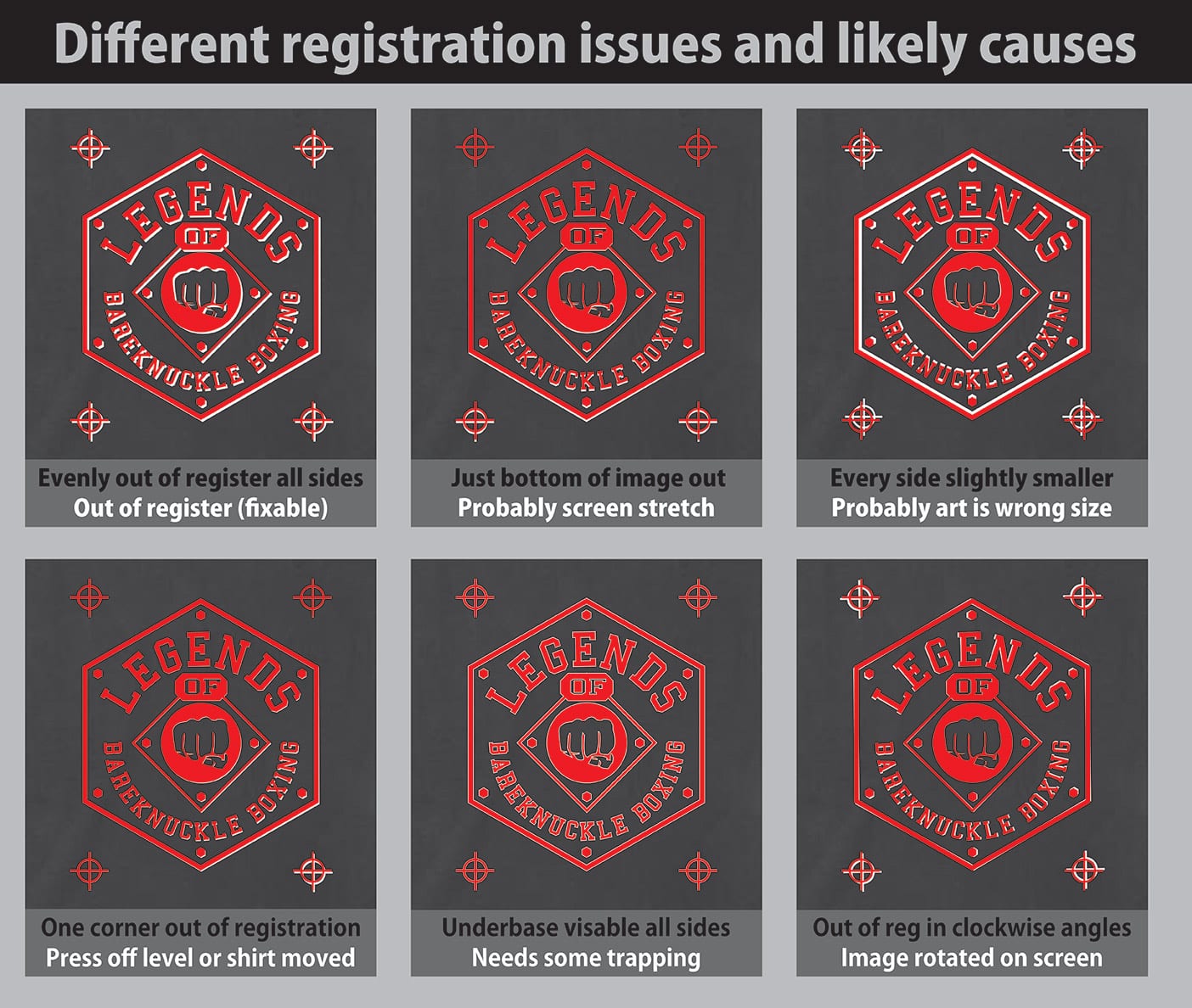
The illustration in Figure 1 shows some of the more common on-press registration problems and the likely causes. As always with screen printing, there are exceptions to every variable, but understanding the usual tendencies can save you time on many jobs.
Two registration difficulties that are hard to illustrate are caused by squeegee angle and ink viscosity. Both of these can contribute to the problem of screen stretch, where the printed image will distort and “grow” longer as it is printed. If an ink is too thick, it can necessitate a higher print pressure and more squeegee flex, which will pull the mesh of the screen over the length of the print and cause visible distortion. This is common with an underbase because the white ink tends to be higher in tack and viscosity. Watch the squeegee during the printing process to see if the blade bends a lot. If you suspect this may be causing the misregistration, then back off the squeegee pressure and reduce the viscosity of the ink as recommended to make it more print friendly without damaging opacity.
Most other registration issues can be combated through a combination of proper trapping of separations and careful screenmaking. For many printers, incorporating a pin registration system in their film/CTS process can literally revolutionize their shops. Set-up times and misprint rates will be slashed because the design elements will be in the same position on every screen, pre-registering the job before it gets to the press.
Dot Gain Compensation
Halftones can let screen printers get more value from their inks by producing more colors with fewer screens.
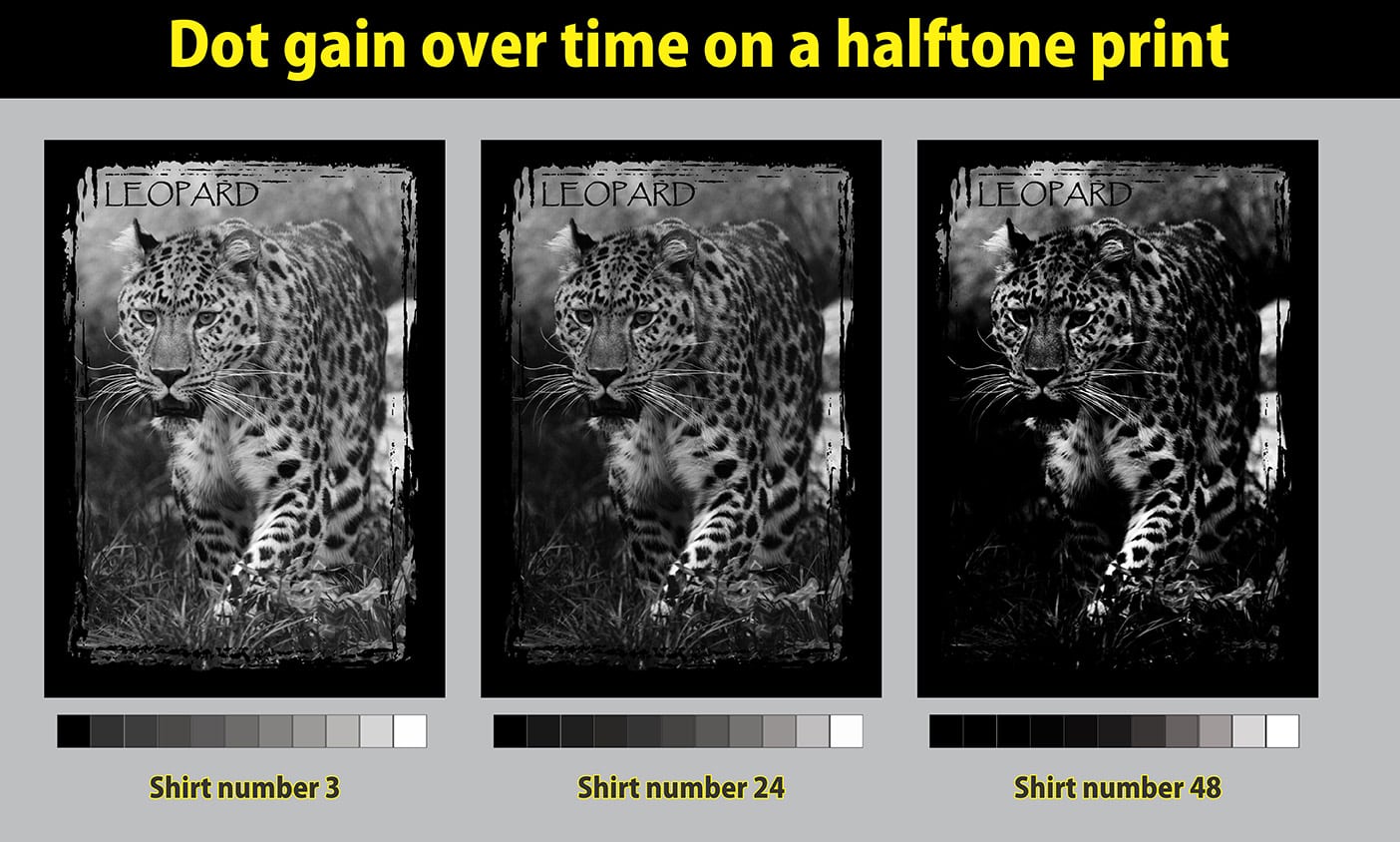
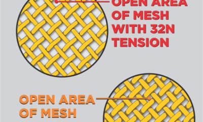
AdvertisementThe downside to printing tiny shapes like dots is that ink has a tendency to stay stuck in them. When this happens, the press operator will notice that the design looks faded and the natural instinct is to increase the squeegee pressure to force the ink out of the screen and onto the garment. But the result is that dots will get flattened out. Over time, they will start to bleed into each other and then slowly begin to fill in until they get darker and darker. After several dozen prints, detail will be lost and the image will look quite different. Then, the press operator will often wipe off the bottom of the screens and the print will go back to its original lighter tone before darkening again after several more prints. The net result of this seesaw dot gain is that the shirts in the order will look different depending on where in the job they were printed. (See Figure 2.)
Here’s a simple fix if dot gain is a common challenge in your shop: Create a separate set of inks for detail work that are all lower in viscosity. This bypasses the problem of the ink being too thick to easily flow through small details in the stencil, so your operators won’t feel like they need to use more pressure or have to contend with ink buildup on the back of the screens. Contact your ink manufacturer and do some testing to find the ideal viscosity level for your detailed prints.

Another common way to control dot gain is using a halftone strip on the sides of your prints. (See Figure 3.) This element adds a small extra step and must be taped off after setup, but it is a wonderful tool for the production department to definitively establish whether the art or the press is causing the problem. If a printed halftone strip clearly shows differentiation between each value and the darker values don’t appear to be filling in solid, then the dot gain is most likely being caused by the art. On the other hand, if the whole strip looks mostly solid (excess pressure will make the 60-90 percent areas totally solid and the 0-30 values almost white), then it’s fair for the art department to suggest there may be a printing issue.
Your artists can adjust their separations for dot gain by lightening the midtones of the halftone curve by 15-20 percent depending on how much gain they anticipate during the run. This allows you to hit your target image value range without compressing the shadow areas in the design too much. Always exercise judgment on this step and consider each design individually because sometimes it may be too much of an adjustment.
Trapping to Prevent Bleeds and Image Gaps
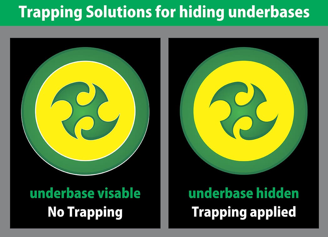
It’s annoying when the underbase of a print is showing when it isn’t supposed to, or when the color of garment is visible because there is a gap between colors. Some printers will attempt to use more pressure to flood the ink out and cover these areas, but this rarely ends well. The best solution is always to create a slight overlap in the top colors of the separations. (See Figure 4.) Known as trapping, this process prevents these problems from happening.
Depending on the shirt color and the nature of the design elements, you may not want to trap every part of a color. Some areas may work better without a trap and learning to spot them takes some experience. A good rule of thumb: On a dark shirt, it’s a good idea to overlap the edges of an underbase slightly, or reduce the underbase edges a bit to allow for some trapping if the top color is supposed to completely cover the underbase. If an outline black element confines parts of the image, you may want just a little overlap where the color and the black outline meet, so the underbase doesn’t show in case of a slight distortion in the printing process.
Too much trapping can also be a problem. Colors can bleed or mash to create poor edge qualities in the final print. The art of good trapping is to compensate just enough so everything fits together and covers the things that it should with just enough allowance for tiny shifts in registration. To determine a good trapping standard for your shop, you can print some detailed lines in white on a black shirt and then overprint this with the exact same artwork in red. You will see some white showing on the sides; measure it to estimate how much of an overlap you would need to cover these edges so no white shows. This is a simple way to approximate the minimal trapping distance necessary for the specific mesh and screen tension used in the test.
Color Matching Steps
Printed inks will not always match the color that is shown on the computer screen. This may sound so obvious that you just rolled your eyes, but for some reason, there is still a prevailing trend for color separations to be created under the assumption that the ink will go onto the shirt and be the same color it was in the bucket.
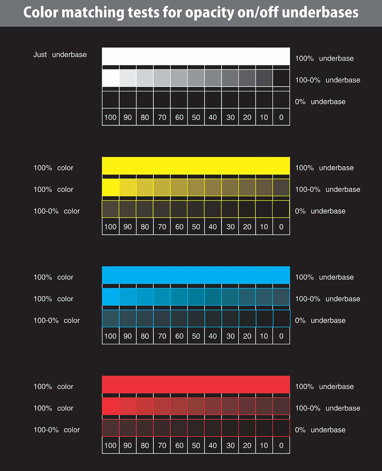
Many variables can change an ink color on press. Some of the more common ones are not enough underbase, an ink that is too transparent, a strong shirt color, and inks blending in unexpected ways on top of each other. But there are many other factors that can result in a color matching problem. To get a handle on this issue, it can be super helpful to print a reference guide of your inks on some sample shirt colors that you consistently use (white, black, royal blue, red, sport gray, etc.). Print them in sequence with several variations on and off of an underbase. This will take an investment of your time, but assuming that you have a standard ink set that you recommend to customers, it’s one of the only ways to really predict what the printed color will look like in different final printed conditions. (See Figure 5.)
It’s important to note that the process I’m recommending isn’t part of the Pantone matching system or simulating PMS colors from corporate logos. It just helps you do your best to match the colors that are in the original image on your computer screen. For matching specific colors in a Pantone book, look to your ink manufacturer. Remember that even with a good ink system, you will often still have the same color matching challenges if prints shift due to the variables mentioned above.
If you find you’re always mixing colors while your press is sitting idle, it’s time to buckle down and create a set of reference prints on different shirt colors. They will give you a much higher probability of hitting a close color match on press. Typically, once you’re on press, your options for adjusting the color are limited. You can change the ink and hope you hit the original hue you were aiming for, or you can attempt to change the art or printing process to minimize the variables that are causing the shift. All of those steps take away valuable press time.
For some jobs, it may be best to go ahead and print out a test strip of your proposed colors on the actual shirts and then use the best values from the test to engineer the separations so that when they hit the press, the colors will be accurate. This type of investment is best saved for high-volume runs or hot-market jobs where press downtime could be a killer to profits.
Using simple strategies and guides can help you troubleshoot on-press problems quickly. Knowing how to define and solve issues related to registration, dot gain, trapping, and color matching will minimize these common issues and get your team printing faster and more profitably.
Read more from the February/March 2019 issue.
Let’s Talk About It
Creating a More Diverse and Inclusive Screen Printing Industry
LET’S TALK About It: Part 3 discusses how four screen printers have employed people with disabilities, why you should consider doing the same, the resources that are available, and more. Watch the live webinar, held August 16, moderated by Adrienne Palmer, editor-in-chief, Screen Printing magazine, with panelists Ali Banholzer, Amber Massey, Ryan Moor, and Jed Seifert. The multi-part series is hosted exclusively by ROQ.US and U.N.I.T.E Together. Let’s Talk About It: Part 1 focused on Black, female screen printers and can be watched here; Part 2 focused on the LGBTQ+ community and can be watched here.


Arcus Printers Barracuda Conveyor Flatbed Cutter

The Profit Impact of a Market Dominating Position

Inkcups Announces New CEO and Leadership Restructure


Bulletins
Get the most important news and business ideas from Screen Printing magazine's news bulletin.

-

 Case Studies2 months ago
High-Density Inks Help Specialty Printing Take Center Stage
-

 Art, Ad, or Alchemy2 months ago
F&I Printing Is Everywhere!
-

 Andy MacDougall2 months ago
Functional and Industrial Printing is EVERYWHERE!
-

 Columns3 weeks ago
8 Marketing Mistakes Not to Make When Promoting Your Screen Printing Services Online
-

 Editor's Note3 weeks ago
Livin’ the High Life
-

 Marshall Atkinson3 weeks ago
How to Create a Winning Culture in Your Screen-Printing Business
-

 Thomas Trimingham2 months ago
“Magic” Marketing for Screen Printing Shops
-

 Case Studies3 weeks ago
Screen Printing for Texture and Depth